SeamossVibes Rebrand: From Health Shop to Premium Wellness
When SeamossVibes first approached me, their products were already loved by a loyal customer base — but their branding didn’t reflect the quality of what was inside the jar. The packaging felt crowded, the visuals leaned toward a “pharmacy shelf” aesthetic, and the photography lacked the premium feel needed to position them as leaders in the Australian wellness space.
That’s where I stepped in — not just as a designer, but as a brand strategist, photographer, and marketer. My goal was clear: transform SeamossVibes into a brand that feels premium, trustworthy, and retail-ready.
1️⃣ The Challenge
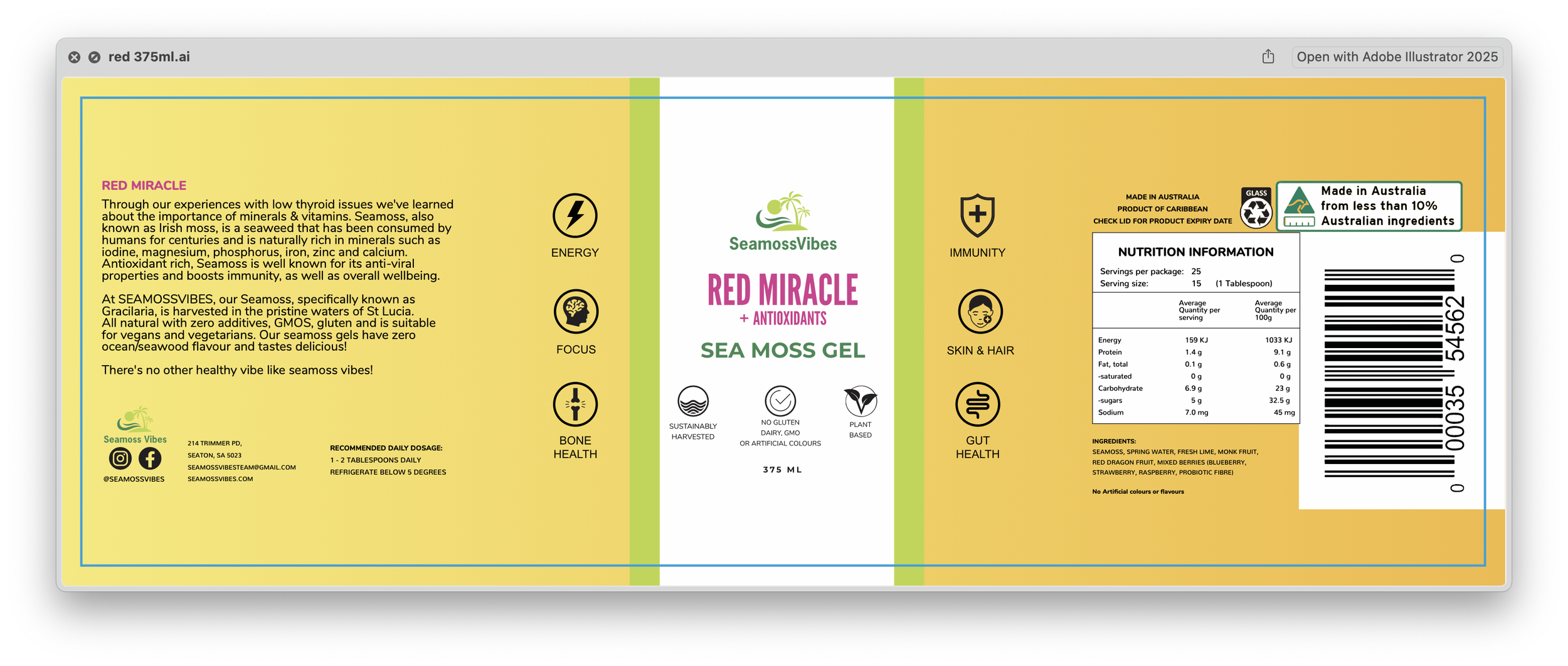
Busy label design with clashing colors and inconsistent typography.
Overloaded with information that made it hard for customers to focus on the key product benefits.
Photography style that was bold but lacked refinement, giving a casual instead of premium impression.
SeamossVibes had a high-quality, all-natural product — but the branding didn’t communicate that value.
2️⃣ The Transformation
Rebrand Strategy:
I stripped away the unnecessary noise and built a new design language around minimalism, clarity, and trust.
New Label Design
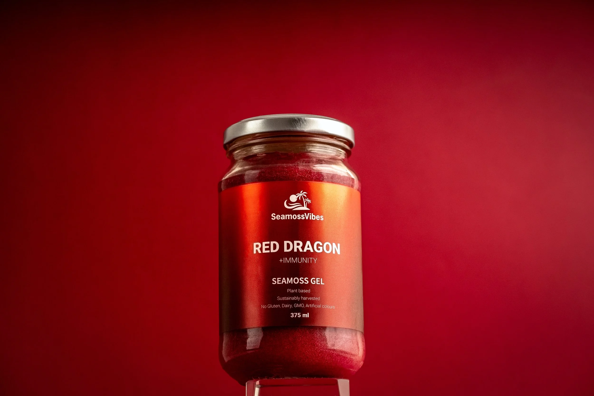
A premium gradient background (rich reds + burgundy) that immediately communicates quality.
Clean white typography and icons for easy readability.
Simplified layout with clear hierarchy: brand, product name, benefits.
Consistency across flavors to strengthen recognition.
Product Photography
Moved from bright, saturated backgrounds to a refined, minimal look.
Focus on negative space and clean staging to highlight the product as the hero.
Professional lighting and editing to emphasize freshness, vibrancy, and luxury.
Updated Marketing & Brand Strategy
Created consistent assets across social media, website, and promotional materials.
Shifted the messaging to emphasize premium wellness and lifestyle, not just health supplements.
3️⃣ The Results
Since the rebrand, SeamossVibes has:
Grown its customer base by attracting health-conscious buyers seeking premium options.
Increased stockists thanks to professional, retail-ready packaging.
Elevated brand perception — now seen as a boutique, premium brand rather than a casual health product.
The jars no longer just sit on the shelf — they stand out.
BEFORE
AFTER
4️⃣ Final Thoughts
This rebrand wasn’t just about creating a new label. It was about reshaping the way SeamossVibes is perceived in the marketplace. By combining design, photography, and marketing strategy, I was able to position them as a premium brand in one of the most competitive wellness categories.
For me, this project reinforces what I believe: great branding doesn’t just look good — it changes how people see your business.


